How to Avoid the Most Common Types Mistakes in Design
 Whether you are using brochures to inform potential customers, business cards to convey your personal information, or posters to advertise your services, selecting the right font for your promotional material is critical for success. While it might seem like the font you use is a relatively unimportant variable in the overall design process, it can be the difference between attracting customers or not. If your type is illegible, messy, and simply not very nice to look at, you aren’t giving yourself the best chance to convert based on your advertisement. Here are a few pointers which can help you avoid some of the most common design issues pertaining to type or font.
Shoot for readability
There are thousands of different fonts available, but that does not mean that each is equally appropriate for your purposes. Whatever the case, you need to choose an easily legible font. Otherwise, you could have the most brilliant copy ever devised and still never convert simply because potential customers struggle to read your material quickly. If it takes too much effort to read, choose a different font.
Attend to the smaller details
Even the smallest inconsistency or sloppiness in type can be a turnoff to a potential customer. Some of the more common small issues are using the wrong type of quotation marks, apostrophes, punctuation, or special characters. For instance, be sure that your quotation marks are pointing the right directions and that you use the longer Em Dash (—) to convey a pause in a thought rather than the shorter hyphen (-).
Use appropriate spacing
Proper spacing also contributes to easy readability. Make sure that the space is the same not only between lines, but also between words and letters as well. Depending on the font you choose, you may need to adjust your line spacing to keep everything neat. You wouldn’t want some letters running together like the stem of a “p” on one line with the stem of a “b” on the line below — that just looks messy.
Understand your medium
Considering the type of promotional material you are creating will help you determine which fonts are appropriate. On a business card, more whimsical fonts or bold all-caps lettering would be unsuitable, but these could be perfect on a social media post. Understand what message you are trying to convey and experiment to find what font looks and works best in that particular medium.
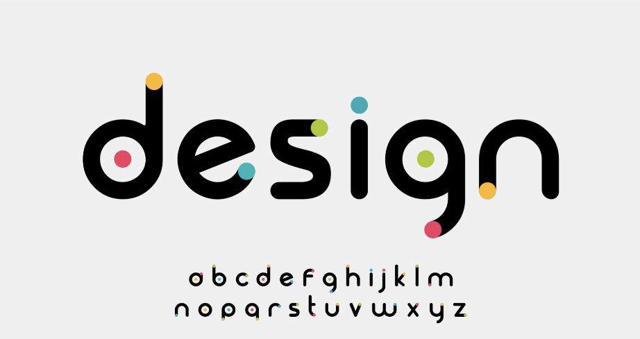
Know when to choose serif vs. sans-serif fonts
Fonts that have extensions or projects at the tips of letters are called serif fonts (e.x. Times New Roman), and those without are called sans-serif fonts (e.x. Calibri). Sans-serif fonts are typically best used online and in digital mediums, whereas physical print is typically in a serif font. If you are using a promotional tool like a poster, you will get the most out of serif font since it is easier to read at a farther distance.
Abbott Communications Group in Central Florida is your one-stop shop for all your printing needs. We take pride in the way we handle every step of the process, from planning out your project to precisely executing your vision and packaging your materials. Whether you are looking for business cards that will really pop, posters to help your business stand out, or engaging brochures, we can do it all and much more. Give us a call today to find out exactly what Abbott Communications Group can do for you at 407-831-2999.